


A crypto casino homepage has a strange job. It has to greet someone who has never heard of the brand, serve a regular who logs in twice a day, and show live money moving across the screen, all inside the same rectangle. Most people decide whether to stay in under ten seconds. Jakob Nielsen’s eye-tracking research on how people scan web pages showed back in 2006 that readers sweep across the top, then drop down the left edge, then give up. Casino designers know this. That’s why the top-left corner is the most expensive real estate on the whole site.
The patterns repeat across the sector because they work. Banner, game grid, live bet feed, heavy footer. Copy, tweak, ship. But the order those blocks appear in says a lot about who a site was built for, and two casinos can use the exact same parts and still feel like different places.
How the Top of the Page Sets Expectations
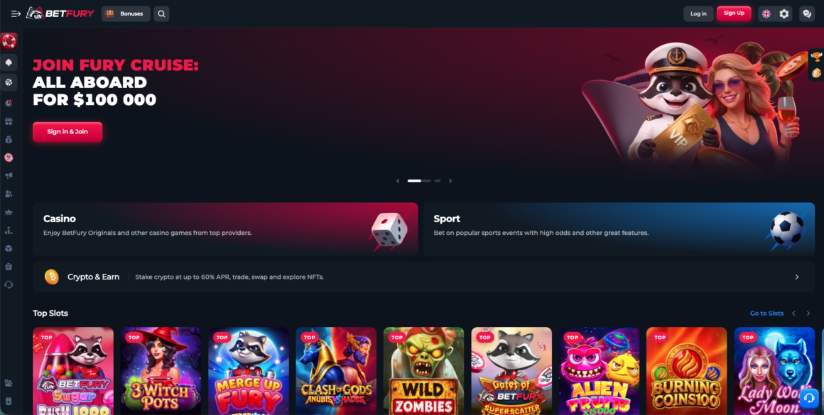
BetFury, online since 2019, works well as a first example. The site leads with its own token and staking mechanics instead of a single flashing welcome banner, which quietly changes the reading order of everything below. Coin-specific sections sit close to the top, so a player holding one asset doesn’t have to dig through a general lobby to find out what works with it. Someone who wants BNB gambling lands on a page organized around that coin, with compatible games already grouped. That sounds like a minor thing. It isn’t, because deposit friction is where most first-timers give up and close the tab. The takeaway for anyone studying homepage layout is simple enough: sort the page by what the player already holds, not by what the casino most wants to push.
What the Hero Section Usually Carries
Almost every crypto casino puts the same ingredients in that first screen, in slightly different proportions.
- A bonus number big enough to read on a cracked phone screen
- One primary button, sometimes a second, and the second one is deliberately weaker
- A countdown, a drop timer, or a rising jackpot counter
- Coin logos, usually somewhere between eight and fourteen of them
- A license badge parked in a corner where it won’t kill the mood
Notice what’s missing. Long text. Nobody reads paragraphs above the fold on a gambling site, and designers stopped pretending otherwise years ago.
Game Tiles Are the Real Interface
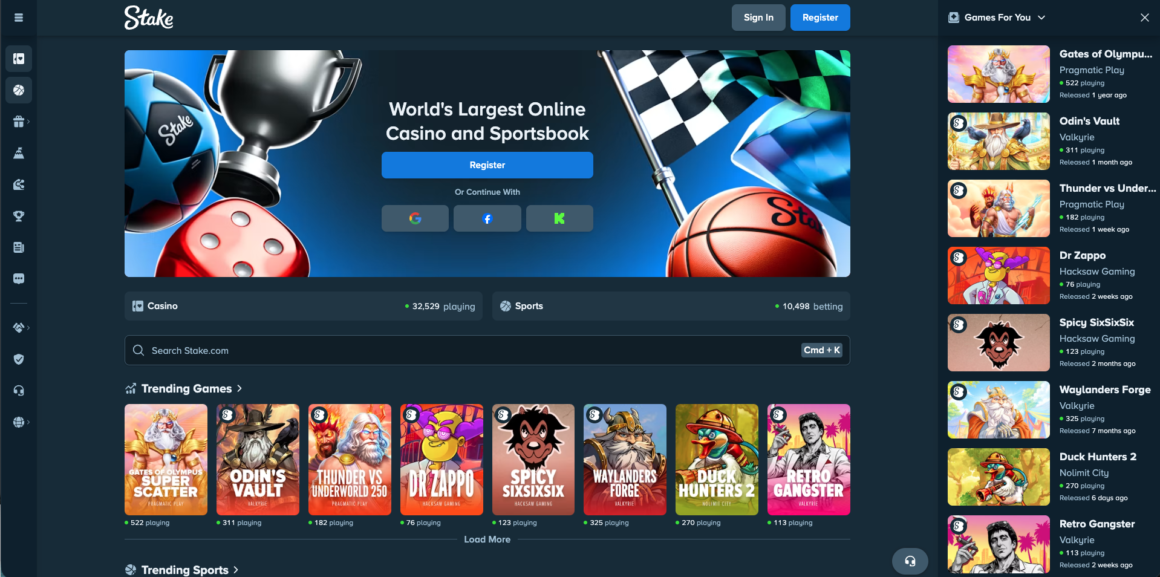
Stake, which has been running since 2017, shows the other main approach. The homepage leans on house-built games instead of a wall of third-party slots. Plinko, Mines, Dice, Crash. Each one gets a tile with custom art in the same portrait ratio, so the grid looks like a single product line rather than a rented catalog. Rows are stacked by category and scroll sideways on mobile, which keeps vertical length under control.
That consistency is the whole trick. When every tile shares a shape, a color logic, and a font, the eye stops evaluating each one separately and starts treating the row as one object.
Tile design follows a few unwritten rules across the industry:
- Portrait ratio beats square, because more tiles fit above the fold
- Provider logos stay small; the game name does the selling
- Hover states reveal RTP or a play button, never both at once
- Live dealer tiles use real video thumbnails, while slot tiles use illustration
- “New” and “Hot” labels sit top-left, where the scan path already goes
Does anyone actually compare RTP numbers on hover? Probably a small minority. But the label being there does something anyway, because it signals the site isn’t hiding math from you.
The Live Feed and the Chat Box
Scroll a bit and you hit the latest bets table. Username, game, wager amount, multiplier, payout. Rows refresh every second or two, and roughly half of any crypto casino’s homepage energy comes from this one component. It’s cheap social proof that never runs out.
Why put a public chat window on a gambling site at all? Because it turns a solo activity into a room with other people in it. Chat also carries “rain” and tipping features on several platforms, where users drop small amounts of coin to whoever is active. Small money, big retention effect.
Numbers That Never Sit Still
Counters are everywhere on these pages. Total wagered, players online, biggest win today. The motion matters more than the value. A static “$4,382,110 wagered” reads like marketing copy, while the same figure ticking upward reads like a live system. Same data. Different feeling entirely.
Trust Signals Live at the Bottom
The footer is where crypto casinos get serious, and it’s usually the least designed part of the page. Curacao or Anjouan license text, a registration number, provider logos in grayscale, responsible gambling links, age icons. It’s dense, gray, and slightly ugly on purpose.
There’s a practical reason for that placement. Regulators and payment partners want the information present and findable; players don’t want it competing with the games. So it sits at the bottom, complete and quiet.
Things worth checking in any footer before depositing:
- The license number, which should be clickable and lead to a verification page
- Named game providers rather than a vague “200+ partners” claim
- A working link to self-exclusion or deposit limit tools
- Company name and registered address, not just a brand logo
Details Most Players Never Notice
Counted once on a phone: getting from a cold homepage load to an actually spinning reel took four taps on one site and nine on another. The nine-tap site had better graphics. It also had a mandatory account step before showing any game in demo mode, which is a design choice, not a technical limit.
A few other small things that separate a well-built page from a template job:
- Dark mode as the default, since bright white backgrounds wash out game art
- A sticky bottom nav bar on mobile with four items maximum
- Skeleton loaders instead of spinners, so the layout doesn’t jump around
- A currency switcher that remembers the choice after logout
Crypto casinos also have a problem regular operators don’t: coin volatility. Showing a balance in BTC alone confuses casual players, so most sites now display a fiat equivalent underneath, updated on the fly. BetFury handles this with a toggle. Others force a display currency at signup, which is faster but less flexible.
Where the Patterns Come From
Most of this layout language didn’t start in gambling. Product grids came from e-commerce, the live feed borrows from trading platforms, and the tile-and-row structure is straight out of video streaming. Casino designers just stripped the parts that slowed things down (filters, reviews, long descriptions) and cranked up the motion.
The odd result is that a crypto casino homepage in 2026 looks more like a stock terminal than a Las Vegas floor. Numbers moving, dark background, dense information, everything one tap away. Whether that’s better design or just faster design is a fair question.
Next time a homepage loads, try counting the taps to your first real bet. The number says more about the operator than any bonus banner does.


